Summary of the June metro inventory data · July 5, 2026 · corrected July 6 — see note
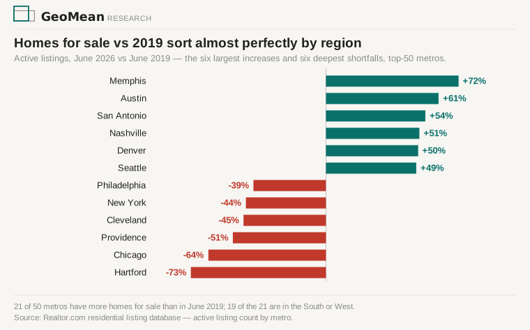
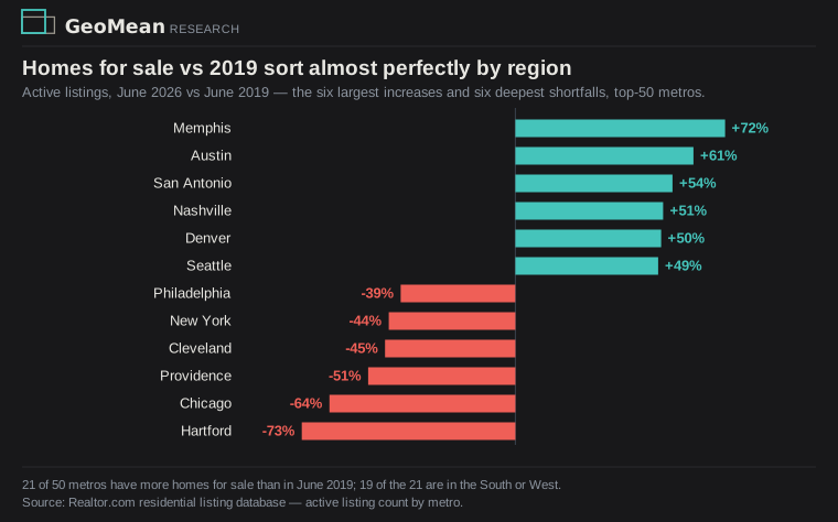
- Homes for sale in the 50 largest US metros have diverged by region: the 28 South and West metros hold 12% more inventory than in June 2019, the 22 Northern metros (Northeast, Midwest, and the Baltimore–Washington corridor) 36% less (Realtor.com listing data). The divide sorts almost perfectly by region: of the 21 metros above their 2019 level, 19 are South or West.
- Listing volume doesn’t explain it. New listings are down about 18% from June 2019 in both regions — owners everywhere hold pandemic-era mortgages they won’t trade away. Sellers behave the same North and South.
- Buyers don’t. Homes under contract are down 20% from June 2019 in the South and West and up 30% in the North — against those similar listing declines. Southern homes accumulate because fewer sell; Northern inventory is nearly gone because demand outruns the thinned flow.
- Prices split the same way. In the 21 metros with above-2019 inventory, the median listing price fell 3.2% over the past year and 23.5% of listings took a price cut in June; in the other 29, prices held near flat and cuts ran 16.2%.
The national figure — existing-home sales at a 4.17 million annual pace in May — averages the two into one frozen market. The metro data shows one freeze in two forms: a South where homes wait for scarce buyers, and a North where buyers wait for scarce homes.
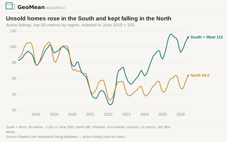
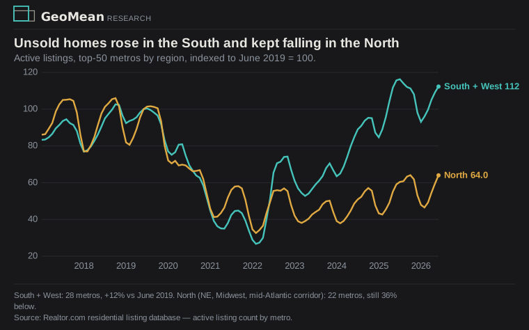
Sellers act the same everywhere; buyers split by region
The listing side of the market is nationally uniform. June new listings ran 18.0% below their 2019 level in the South and West and 18.5% below in the North — the lock-in effect at a 6.4% mortgage rate, applied evenly. Nobody is flooding the Southern resale market with homes. One channel this data cannot see: newly built homes sold directly by builders mostly bypass these listings, so Southern buyers shifting to new construction would look like vanished resale demand here — Census new-home sales by region is the check, and a follow-up.
What differs is absorption. Homes under contract are down 20.3% versus 2019 across the South and West and up 29.9% across the North — demand itself, not a ratio artifact. Relative to what’s on the market, the pending ratio (homes under contract per home for sale) fell by a third in the South (0.59 to 0.40) and rose three-quarters in the North (0.46 to 0.80). The same thinned stream of listings piles up in Austin and disappears in Hartford, which in June had 1,208 homes on the market for a metro of 1.2 million people, 73% fewer than in 2019.
Where buyers thinned out, prices are falling
Plotted by inventory against price change, the 50 metros line up: metros with more unsold homes than 2019 cluster in falling prices, metros with fewer cluster in flat-to-rising ones.
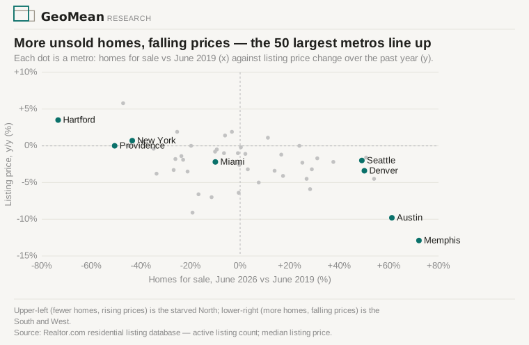
Memphis (+72% inventory vs 2019) has listing prices down 13% over the year; Austin (+61%) down 10%; Hartford (−73%) and Chicago (−64%) are still posting price gains. In the above-2019 group as a whole, 23.5% of June listings carried a price cut. Median days on market across the 50 metros is just 1.5 days longer than in June 2019 — the homes that sell still sell quickly; the change is how many of them do.
Neither region is a functioning market
The South and West have selection and falling prices but a thinned buyer pool — a slow buyer’s market. The North has demand but almost nothing to buy — a fast, starved market where prices hold flat while Southern prices fall. Two questions remain: who the remaining Southern buyers are, and whether Northern prices can keep holding as volume shrinks.
Correction (July 6, 2026): the original version of this piece, published July 5, attributed the Southern inventory recovery to homebuilding (“the South rebuilt it,” “inventory recovered where builders build”). The listing data does not support that mechanism: new listings are down ~18% versus 2019 in both regions, and the divergence traces to demand — homes under contract are down 20% in the South and up 30% in the North versus 2019. The title, framing, and one section have been rewritten accordingly; all inventory, price, and price-cut figures are unchanged.
Sources: Realtor.com residential listing database — active listing count, new listing count, pending ratio, median listing price, price-reduced share, and days on market by metro (monthly; the same series FRED mirrors as ACTLISCOU*). Regional composites are the top-50 metros by household count, split by a north–south line: the Northern group (22) is the Northeast and Midwest plus the Baltimore–Washington–Richmond corridor and Louisville; the Southern group (28) is the rest of the South and the West. Realtor.com flags Memphis’s recent observations for data quality; adjacent months show the same levels, so its figures stand with that caveat noted. Extracts, composites, and the pull script are archived in the GeoMean data files. A June table circulated by Lance Lambert (ResiClub) prompted this look; all figures are computed independently from the origin data. Builds on the Housing dashboard and the Jul 3 weekly.